Gainwell UX Platform
A modern identity for a complex healthcare portal.
Gainwell wanted to modernize an outdated Medicaid pharmacy portal and bring it into alignment with its visual identity. Using the existing design system and supplied content, I designed audience-specific pages and a provider dashboard across desktop and mobile.
- My role
- Portal experience design, visual refresh, and content organization
- Context
- Healthcare · Portal modernization · Desktop and mobile
Modernizing an outdated portal
The project started with an outdated portal design that needed a visual refresh. The brief was to bring the experience into Gainwell’s visual identity while supporting the required pages and content. I used the existing design system to shape the layouts, navigation, and content hierarchy across the portal. Gainwell supplied the underlying system, requirements, and content.
One portal. Different audiences.
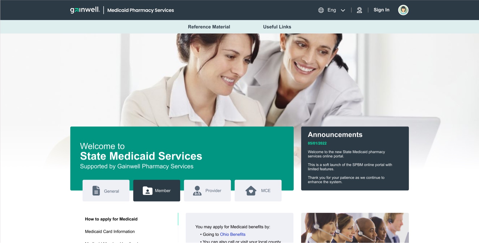
The public portal gives General, Member, Provider, and Managed Care Entity audiences distinct entry points. A shared header and audience navigation connect the experience, while the content changes for each group. Members see benefit and application resources; providers see registration, enrollment, and billing material. This shared structure carries Gainwell’s visual language across pages with different information needs.
Give dense information a clear hierarchy
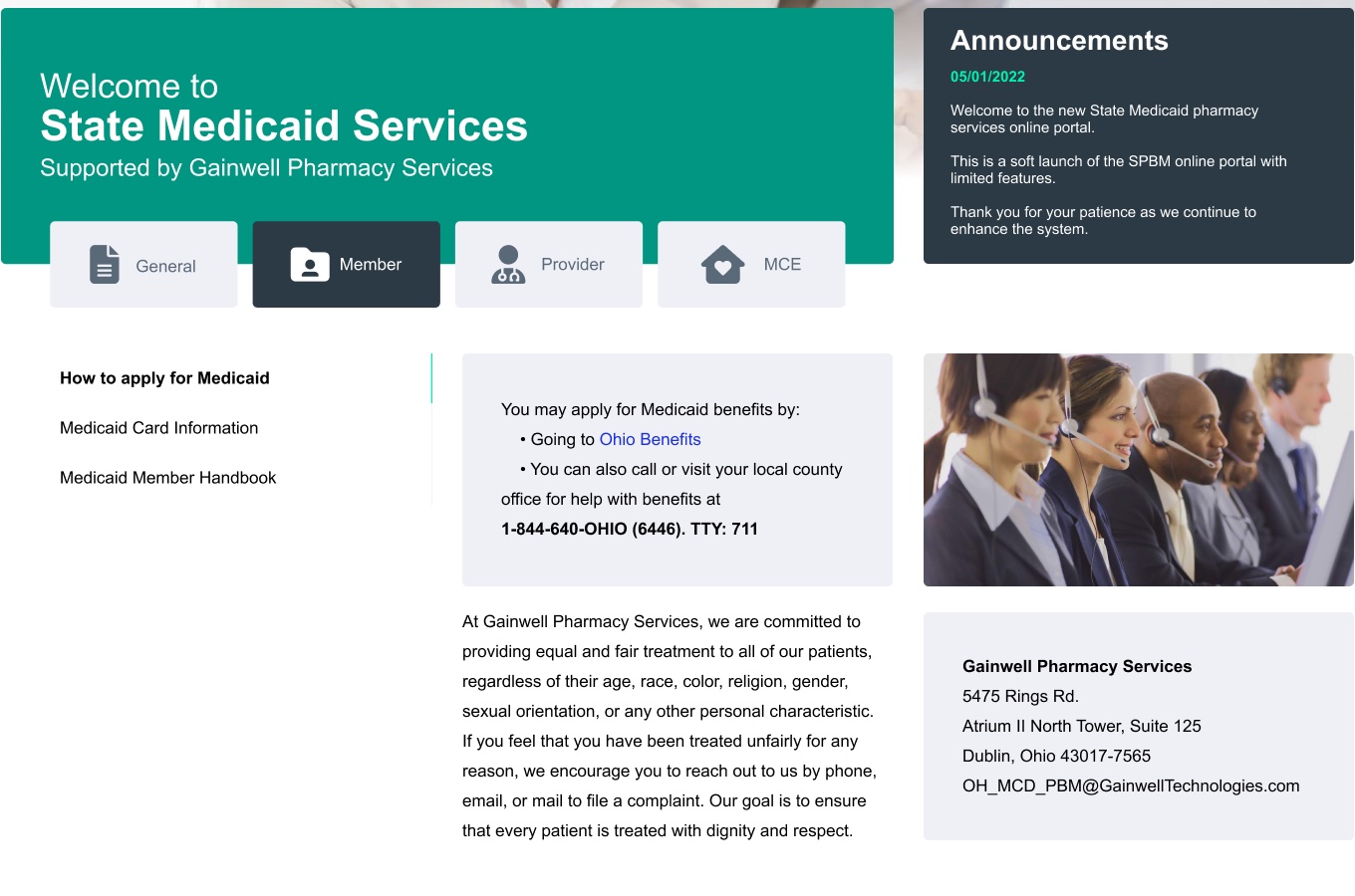
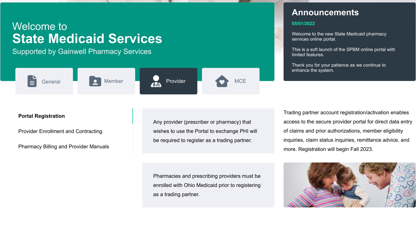
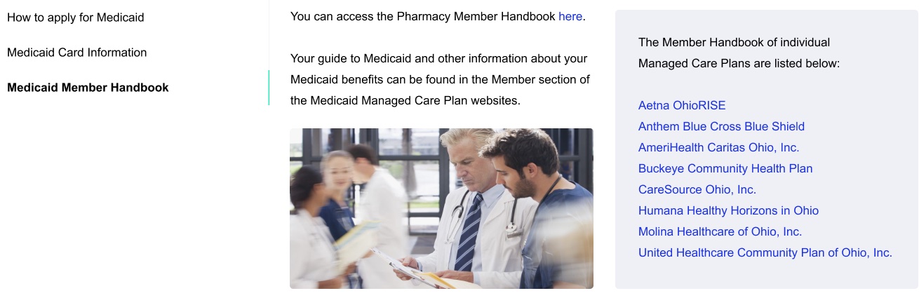
The member experience brings application guidance, Medicaid card information, handbooks, and contact details into one layout. Navigation gives the main topics a consistent place, while content cards distinguish guidance and support information. The provider pages use the same visual language for registration prerequisites and enrollment guidance. My work focused on organizing the supplied material and defining its hierarchy within the interface.
A provider home organized around actions
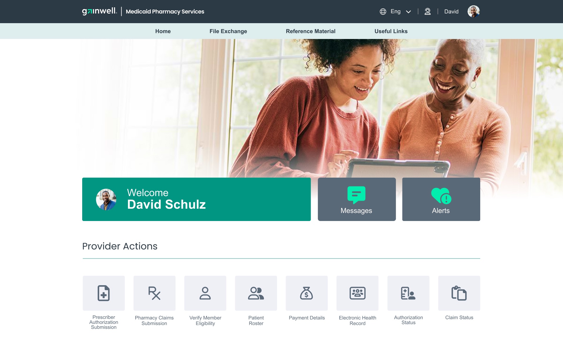
The signed-in provider dashboard shifts the emphasis from reference information to actions. Eight entry points cover authorization submission, pharmacy claims, member eligibility, patient rosters, payments, health records, authorization status, and claim status. Messages and alerts sit beside the welcome area. Help and contact options form a separate group below, keeping operational entry points and support clearly defined within the dashboard.
Carry the experience onto mobile
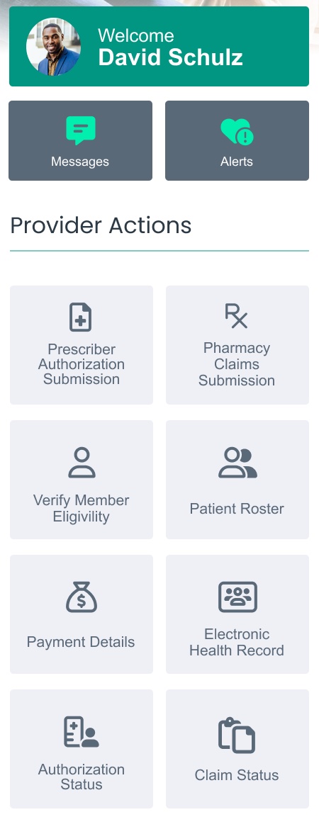
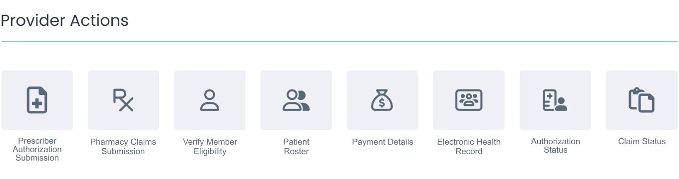
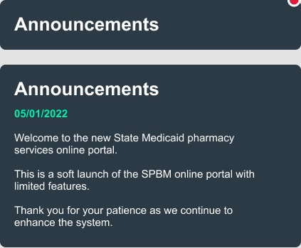
On desktop, provider actions span a horizontal row. The mobile design arranges the same actions into a two-column grid, with messages and alerts above. The layout changes to suit the narrower screen while retaining the task labels and visual language. Mobile announcement components also include compact and expanded states, giving service updates a dedicated place in the interface.
A refreshed portal within an established system
The redesign applies Gainwell’s visual identity across public audience pages, a provider dashboard, and mobile layouts. My contribution combined the visual refresh with content organization and page hierarchy, translating supplied requirements into a connected set of interface designs.
Credits
Portal experience design, visual refresh, and content organization: Mauro Hernandez. Existing design system, requirements, and supplied content: Gainwell.
KEEP EXPLORING